ARX Time Series Model

 Type: Object
 Data: A, B matrices
 Inputs: Input (u)
 Outputs: Output (y)
 Description: ARX Time Series Model
 APMonitor Usage: sys = arx
 GEKKO Usage: y,u = m.arx(p,y=[],u=[])
ARX time series models are a linear representation of a dynamic system in discrete time. Putting a model into ARX form is the basis for many methods in process dynamics and control analysis. Below is the time series model with a single input and single output with k as an index that refers to the time step.
$$y_{k+1} = \sum_{i=1}^{n_a} a_i y_{k-i+1} + \sum_{i=1}^{n_b} b_i u_{k-i+1}$$
With na=3, nb=2, nu=1, and ny=1 the time series model is:
$$y_{k+1} = a_1 \, y_k + a_2 \, y_{k-1} + a_3 \, y_{k-2} + b_1 \, u_k + b_2 \, u_{k-1}$$
There may also be multiple inputs and multiple outputs such as when na=1, nb=1, nu=2, and ny=2.
$$y1_{k+1} = a_{1,1} \, y1_k + b_{1,1} \, u1_k + b_{1,2} \, u2_k$$
$$y2_{k+1} = a_{1,2} \, y2_k + b_{2,1} \, u1_k + b_{2,2} \, u2_k$$
Time series models are used for identification and advanced control. It has been in use in the process industries such as chemical plants and oil refineries since the 1980s. Model predictive controllers rely on dynamic models of the process, most often linear empirical models obtained by system identification.
from gekko import GEKKO
import numpy as np
import pandas as pd
import matplotlib.pyplot as plt
# load data and parse into columns
url = 'http://apmonitor.com/do/uploads/Main/tclab_dyn_data2.txt'
data = pd.read_csv(url)
t = data['Time']
u = data['H1']
y = data['T1']
m = GEKKO()
# system identification
na = 2 # output coefficients
nb = 2 # input coefficients
yp,p,K = m.sysid(t,u,y,na,nb,pred='meas')
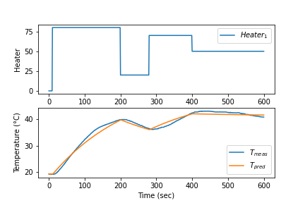
plt.figure(figsize=(7,4))
plt.subplot(2,1,1)
plt.plot(t,u,label=r'$Heater_1$')
plt.legend()
plt.ylabel('Heater')
plt.subplot(2,1,2)
plt.plot(t,y)
plt.plot(t,yp)
plt.legend([r'$T_{meas}$',r'$T_{pred}$'])
plt.ylabel('Temperature (°C)')
plt.xlabel('Time (sec)')
plt.tight_layout()
plt.savefig('test.png',dpi=300)
plt.show()
import numpy as np
import pandas as pd
import matplotlib.pyplot as plt
# load data and parse into columns
url = 'http://apmonitor.com/do/uploads/Main/tclab_dyn_data2.txt'
data = pd.read_csv(url)
t = data['Time']
u = data[['H1','H2']]
y = data[['T1','T2']]
m = GEKKO()
# system identification
na = 2 # output coefficients
nb = 2 # input coefficients
yp,p,K = m.sysid(t,u,y,na,nb,pred='meas')
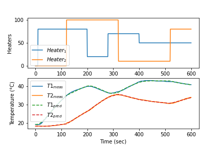
plt.figure(figsize=(7,4))
plt.subplot(2,1,1)
plt.plot(t,u,label=r'$Heater_1$')
plt.legend([r'$Heater_1$',r'$Heater_2$'])
plt.ylabel('Heaters')
plt.subplot(2,1,2)
plt.plot(t,y)
plt.plot(t,yp,'--')
plt.legend([r'$T1_{meas}$',r'$T2_{meas}$',\
r'$T1_{pred}$',r'$T2_{pred}$'])
plt.ylabel('Temperature (°C)')
plt.xlabel('Time (sec)')
plt.tight_layout()
plt.savefig('test.png',dpi=300)
plt.show()
These models are typically in the finite impulse response, time series, or linear state space form. Once in APMonitor form, nonlinear elements can be added to avoid multiple model switching, gain scheduling, or other ad hoc measures commonly employed because of linear MPC restrictions.
Example ARX in GEKKO
from gekko import GEKKO
import matplotlib.pyplot as plt
na = 2 # Number of A coefficients
nb = 1 # Number of B coefficients
ny = 2 # Number of outputs
nu = 2 # Number of inputs
# A (na x ny)
A = np.array([[0.36788,0.36788],\
[0.223,-0.136]])
# B (ny x (nb x nu))
B1 = np.array([0.63212,0.18964]).T
B2 = np.array([0.31606,1.26420]).T
B = np.array([[B1],[B2]])
C = np.array([0,0])
# create parameter dictionary
# parameter dictionary p['a'], p['b'], p['c']
# a (coefficients for a polynomial, na x ny)
# b (coefficients for b polynomial, ny x (nb x nu))
# c (coefficients for output bias, ny)
p = {'a':A,'b':B,'c':C}
# Create GEKKO model
m = GEKKO(remote=False)
# Build GEKKO ARX model
y,u = m.arx(p)
# load inputs
tf = 20 # final time
u1 = np.zeros(tf+1)
u2 = u1.copy()
u1[5:] = 3.0
u2[10:] = 5.0
u[0].value = u1
u[1].value = u2
# customize names
mv1 = u[0]
mv2 = u[1]
cv1 = y[0]
cv2 = y[1]
# options
m.time = np.linspace(0,tf,tf+1)
m.options.imode = 4
m.options.nodes = 2
# simulate
m.solve()
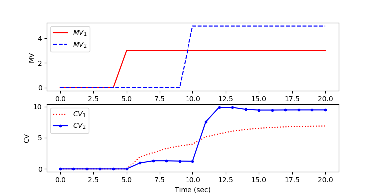
plt.figure(1)
plt.subplot(2,1,1)
plt.plot(m.time,mv1.value,'r-',label=r'$MV_1$')
plt.plot(m.time,mv2.value,'b--',label=r'$MV_2$')
plt.ylabel('MV')
plt.legend(loc='best')
plt.subplot(2,1,2)
plt.plot(m.time,cv1.value,'r:',label=r'$CV_1$')
plt.plot(m.time,cv2.value,'b.-',label=r'$CV_2$')
plt.ylabel('CV')
plt.xlabel('Time (sec)')
plt.legend(loc='best')
plt.show()
Example Model in APMonitor
 Objects
   sys = arx
 End Objects

 Parameters
   mv1
   mv2
 End Parameters

 Variables
   cv1 = 0
   cv2 = 0
 End Variables

 Connections
   mv1 = sys.u[1]
   mv2 = sys.u[2]
   cv1 = sys.y[1]
   cv2 = sys.y[2]
 End Connections

 File sys.txt
   2 ! inputs
   2 ! outputs
   1 ! number of input terms
   2 ! number of output terms
 End File

 File sys.alpha.txt
   0.36788, 0.36788
   0.223, -0.136
 End File

 File sys.beta.txt
   0.63212, 0.18964
   0.31606, 1.2642
 End File
Also see: